Introduction
There are over 1 billion websites, on the world wide web. Yet an overwhelming majority of businesses simply fail to make an impact, with their website, and often the main reason is poor user experience. Building websites and mobile apps is not an art or science, but a combination of both of these disciplines. An ideal web experience can be achieved only after combining the goals of your business with the goals of your prospective or current customers.
User Experience Design is gaining traction by every passing day and more and an ever-increasing number of designers are realising the importance of a website centered on user experience. In this article we will discuss 5 tips for building an enticing and effective user experience.
1. Light and Clean
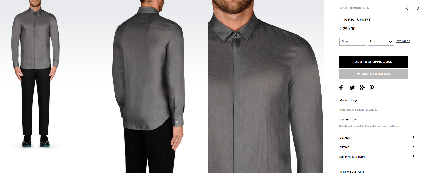
Gone is the day of “heavy” websites with a myriad of content and heavy graphics. Light & Clean, is the new trend for websites. The “White Space” provides for a spacious, modern feel and makes rich visual content stand out. Below, is a good example of a product page by Emporio Armani. A crisp, rich visual of a grey silk shirt looks more enticing on a white background and gives a page a contemporary and modern look, which is a tick for great user experience.

2. Call-to-Action
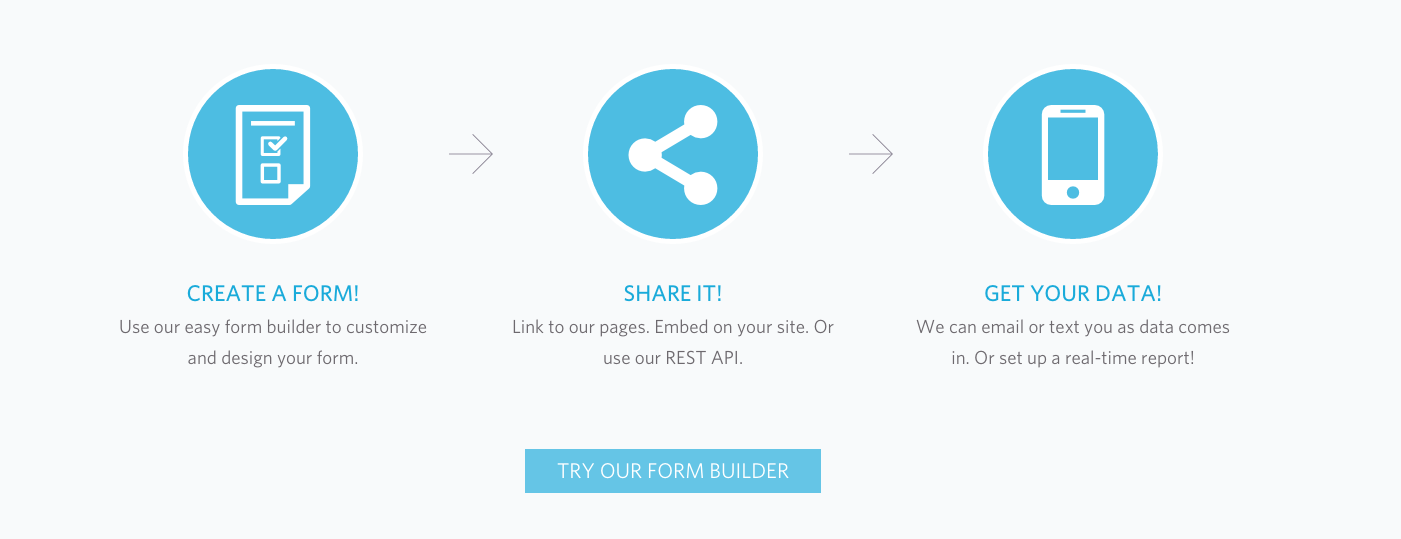
If you don’t ask – you don’t get. Sometimes, the simplest way to achieve a conversion of your goals – is to ask for it. Call-to-actions are a great way to guide the users to perform a desired action, be that to subscribe to your newsletter or achieve a sale. Make sure to get the tone right, aiming for a subtle push in the right direction, rather than a forceful shove – that is a sure way to achieve a counter-effect. Wufoo, provides a subtle yet effective example of a call-to-action, below.

3. Responsive Design
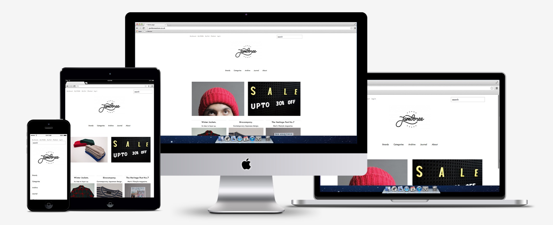
The latest IMRG Capgemini Benchmarking Report has revealed that mobile has overtaken desktop website traffic. What does that mean for you? Only that you are ignoring >50% of your customers/visitors, if your website isn’t optimised for mobile devices. Furthermore, according to a recent industry survey, 36% of visitors, that encounter an unoptimised website will go to its competitors, that have gone through the trouble. Conclusion – make sure that your website is optimised for all devices that your prospect customers/visitors might use. Below, is a great example of Jamboree store, offering a device-tailored user experience, on their website.

4. Strategic Content Placement
Strategic placement is just as important, on your website, as it is on a battlefield. It is not enough to have great, visually enticing content, without any correlation or thought put behind where it will best serve it’s purpose. Strategically placed content can lead to improved conversion rates as well as a larger checkout basket. Below, is a great example of Hugo Boss incorporating a “Pair with” bar where they suggest items that can be paired with an individual product that you have chosen.

5. Feedback
A great user experience can’t be achieved without constantly improving and optimising your website. While there are guidelines that all websites should follow, the rest will depend on your knowledge of what your customers/visitors want. This can only be achieved by customer feedback. Make sure that your website has a feedback form, that is easily accessible, making it a more seamless process. Also try to encourage your visitors to leave a feedback, with a call-to-action. Below is an example of Q Hotel’s feedback area, with a simple call-to-action.

What Next?
Knowledge is only as good as its application. Why not take a step in the right direction and entrust putting this knowledge, into action, to a team of professional s with over 10 years experience in website construction and optimisation?
Our qualified team of digital wizards will handle your project, on an individual basis, and provide you with a tailored solution that will optimise your user experience and ensure growth across the metrics that matter to you. Let’s talk!


I could not resist commenting. Perfectly written!